I have had the privilege of doing a lot of traveling over the past several years. My friends can tell you that no matter where we are in the world, I can always find a Starbucks. Something about the logo makes it easy to spot and is an instant connection to something familiar. The Starbucks down the road from my house is a place where they know me and know my favorite drink (Grande Nonfat No Water Extra Hot Chai Latte). In fact…if I ever get anything else, they usually ask me to repeat my order or question why the change? I like that. Of course that means that I have fallen right into Howard Schultz‘s plan of Starbucks becoming a Third Place for many people.
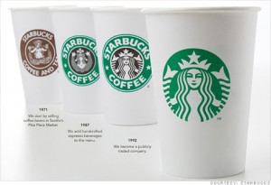
I read an article in the Harvard Business Review the other day about the new logo that Starbucks is unveiling this year. The article talked about the fact that the logo redesign is a direct correlation to the direction Starbucks has been moving in for quite sometime. If you look at the cups above, the cup on the far left demonstrates specifically a coffee house. As you move further to the right, you can see the logo represents something a little more trendy and simple…but still focused on coffee. The new logo on the far right demonstrates that it isn’t all coffee. For instance, I have a Starbucks Coffee cup sitting on my desk right now…and I have never had their coffee. Starbucks has now ventured past coffee and simple pastries into breakfast, lunch, snacks, merchandise, etc. I’m sure it’ll take everyone some time to get used to the new logo, but it’s nice to see Starbucks trying to keep things fresh.


